The Kitchen Cabinet Details That Have the Most Impact on How a Kitchen Actually Looks
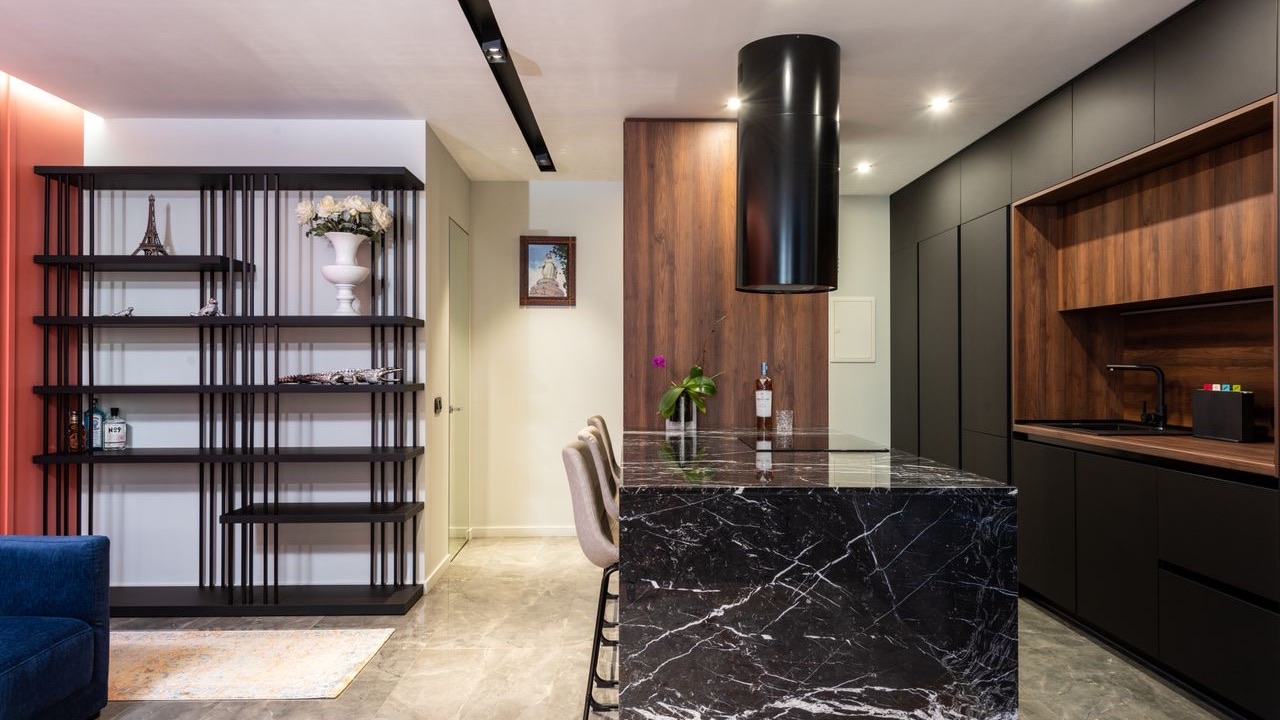
When people think about what makes a kitchen look good, they usually think about the big decisions first: door style, finish color, whether to go with open shelving or closed storage. Those choices matter, but they’re often not where the visual outcome is decided. The details that most consistently separate a kitchen that looks considered from one that looks assembled are smaller — and they’re easier to get right once you know what to look for.
This isn’t a list of design trends. It’s a list of the specific specifications that affect how a kitchen reads visually, regardless of which style direction you’ve chosen.
Gap consistency
The gaps between cabinet doors and between doors and frames are small in absolute terms — typically 2-4mm — but they’re one of the most visible indicators of cabinet quality and installation precision. Consistent, even gaps read as deliberate and refined. Gaps that vary across the run, or that widen at one end because the wall isn’t perfectly plumb, read as slightly off even when the viewer can’t articulate exactly what’s wrong.
This matters more in modern flat-front kitchens than in traditional shaker or raised-panel styles because there’s less visual complexity to mask small inconsistencies. A flat slab door with uneven reveals is harder to overlook than the same gap on a door with a face frame and decorative molding.
The gap specification is partly a manufacturing tolerance issue and partly an installation issue. Cabinets manufactured to tight tolerances can still have inconsistent gaps if the installation doesn’t account for wall and floor irregularities. Before finalizing a cabinet specification, it’s worth asking both about the manufacturing tolerance and about how the installation team handles leveling and scribing in spaces that aren’t perfectly square.
Handle position and consistency
Hardware placement has a disproportionate effect on how a kitchen looks. Handles or pulls that are positioned inconsistently — slightly higher on one door than another, at different angles on adjacent drawers — create visual noise that’s immediately noticeable even if the overall kitchen is well-designed.
The question of where handles are placed is a design decision. The question of whether they’re placed consistently is a precision and process question. On large kitchen orders with multiple installers working in parallel, handle placement consistency requires a shared template or jig rather than individual judgment on each piece. Kitchens installed without a positioning template reliably show small variations that accumulate into a visually busy result.
For handleless kitchens — using integrated grip profiles or push-to-open mechanisms instead of applied hardware — this particular variable is eliminated, which is one reason handleless designs read as cleaner rather than just more minimal.
Toe kick height and depth
The toe kick — the recessed panel at the base of the cabinets — is easy to overlook in the specification process because it’s at floor level and doesn’t appear prominently in rendered kitchen views. It’s also one of the details that affects the overall proportion of the kitchen most significantly when it’s wrong.
A toe kick that’s too shallow makes the base cabinets look like they’re sitting on the floor rather than floating above it, which flattens the visual rhythm of the kitchen. A toe kick that’s too tall can make the cabinet run look strangely elevated. The standard dimension — typically 90-100mm high and 50-60mm recessed — exists for good reason, and deviating from it requires a clear design rationale.
The finish and material of the toe kick also matter more than they usually receive in the design process. A toe kick that matches the cabinet finish reads as a continuous, intentional surface. One that’s a slightly different color or sheen draws attention to itself as a separate element.
Upper cabinet height and ceiling relationship
How upper cabinets relate to the ceiling is one of the most significant visual decisions in a kitchen, and it’s often treated as a default rather than a design choice. The standard approach — upper cabinets that stop 300-400mm below the ceiling with a gap above — creates a horizontal shelf of space that collects dust and visually fragments the kitchen vertically.
Taking upper cabinets to the ceiling removes that gap and makes the kitchen read as taller, more resolved, and more custom. It also eliminates storage space that’s awkward to use. Whether the tradeoff is worthwhile depends on the ceiling height and how the kitchen is used.
When the ceiling height makes full-height uppers impractical, the alternative is a deliberate treatment of the space above: open display shelving, crown molding that transitions the cabinet top to the ceiling, or deliberately leaving the space clear and treating it as a visual breathing room rather than an unresolved detail.
The transition at the end of a run
Where a cabinet run terminates — at a wall, at an appliance, at an open end — is a detail that frequently looks unresolved in kitchens that otherwise seem well-specified. An exposed cabinet end that shows the raw panel edge, or a filler strip that’s a slightly different shade than the door fronts, or a transition to the wall that’s caulked rather than properly scribed, signals that the finish work wasn’t quite complete.
End panels that match the door fronts in material, finish, and profile, and runs that are properly scribed to adjacent walls, are the standard for work that reads as finished. These aren’t difficult to specify — they’re standard options with most cabinet manufacturers — but they require being explicitly included in the order and verified at installation rather than left to default.
Countertop overhang at the front
The overhang of the countertop beyond the cabinet face affects both the ergonomics of the kitchen and its visual proportions. A standard overhang of 30-40mm is enough to protect the cabinet face from drips and spills and provides a comfortable grip edge when working at the counter.
When the overhang is inconsistent across the run — which can happen when the cabinets aren’t perfectly in line — it creates an irregular edge shadow that’s subtly distracting. When the overhang is too small, the counter and cabinet read as a single vertical plane rather than a horizontal surface sitting on a support structure, which flattens the visual depth of the kitchen.
Exploring the range of custom cabinets ideas is useful for identifying design directions, but the visual quality of the final result depends as much on these execution details as on the style choices. A well-specified kitchen with careful attention to gap consistency, hardware placement, transitions, and proportions will look more resolved than a design with strong concept and inconsistent execution.